In the last few weeks there are some super updates to the guidance from NHS Digital and NHS England that will help GP practices to create inclusive content and usable websites. It should also make lives easier for people who need to use the ‘Digital front door’, aka GP practice websites.
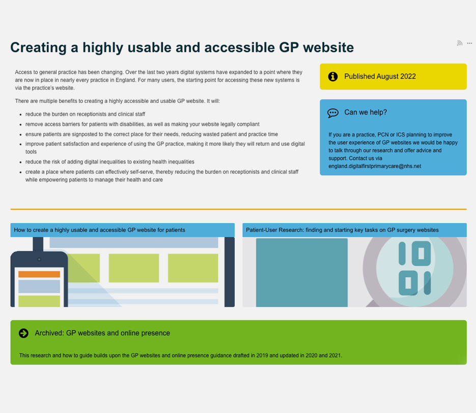
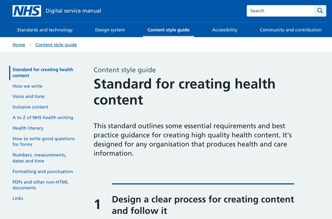
I’m talking about the updates to the NHS Digital service manual, Content style guide and the ‘Creating a highly usable and accessible GP Website‘ from NHS England’s user research team, Dominic Vallely and Emmy Graham. We’ll be exploring the content style guide and the ways in which practices communicate with patients in a joint event with Nexer Digital on the 12th October 22 (have a peek on Twitter at #LettersHack) – more detail to follow soon.
If you’ve followed my other GP website blogs, you’ll realise that I have a bit of thing for GP websites. In my day job, I sit at the intersection between policy makers, NHS commissioners, specialists in inclusive and accessible research and service design, product suppliers and the people in practices who try and make sense of it all, to provide services to us as patients in the NHS. It’s a nice place to sit. I don’t need to be a specialist, I don’t need to have the technical know-how, and although I do know a fair bit about General Practice, service improvement and delivery, we all have experiences as patients that we can lean on and learn from. This guidance brings much of that knowledge into one place.
This is why the guides are so helpful:
GP Practices have a myriad of contract requirements to meet, in fact there are 10 pages of items listed in the ‘highly usable website guide’. Many of them are iterations of earlier contract requirements, it’s no wonder practice teams are confused – I’m confused by much of it too. The GP website supplier market is large, as is the online consultation market and each supplier clearly wants to do the best for their clients – the practices. But occasionally and possibly due to the market competition, these suppliers sometimes focus a bit too much on their own branding and product and not quite enough on the usability of their product, either from a General Practice team perspective or the intended end user, i.e. the patient. They may forget that their product needs to be connected to another NHS service and so needs to conform to the standards and style of the NHS brand, which is trusted and researched to reach as many people as possible. Often, the user is confused when they access information online and get diverted off to a supplier’s platform, or suddenly the page no longer looks like their GP practice or even an NHS service.

Hilary Stephenson, Managing Director at Nexer Digital says:
‘It’s great to see the convergence of user centred design standards and technical platforms across the NHS and their vendor network. Sadly, in our work we have seen real issues with the core usability and accessibility of websites, consultation platforms and apps used for digital engagement. This feels like such a missed opportunity at a time where digital inclusion is vital for patients, their families and those delivering services under immense pressure. Anything that provides practical guidance, which is evidenced by user research and makes things more inclusive, from content design through to platform configuration, will improve the experience for patients, clinicians and administrative teams.
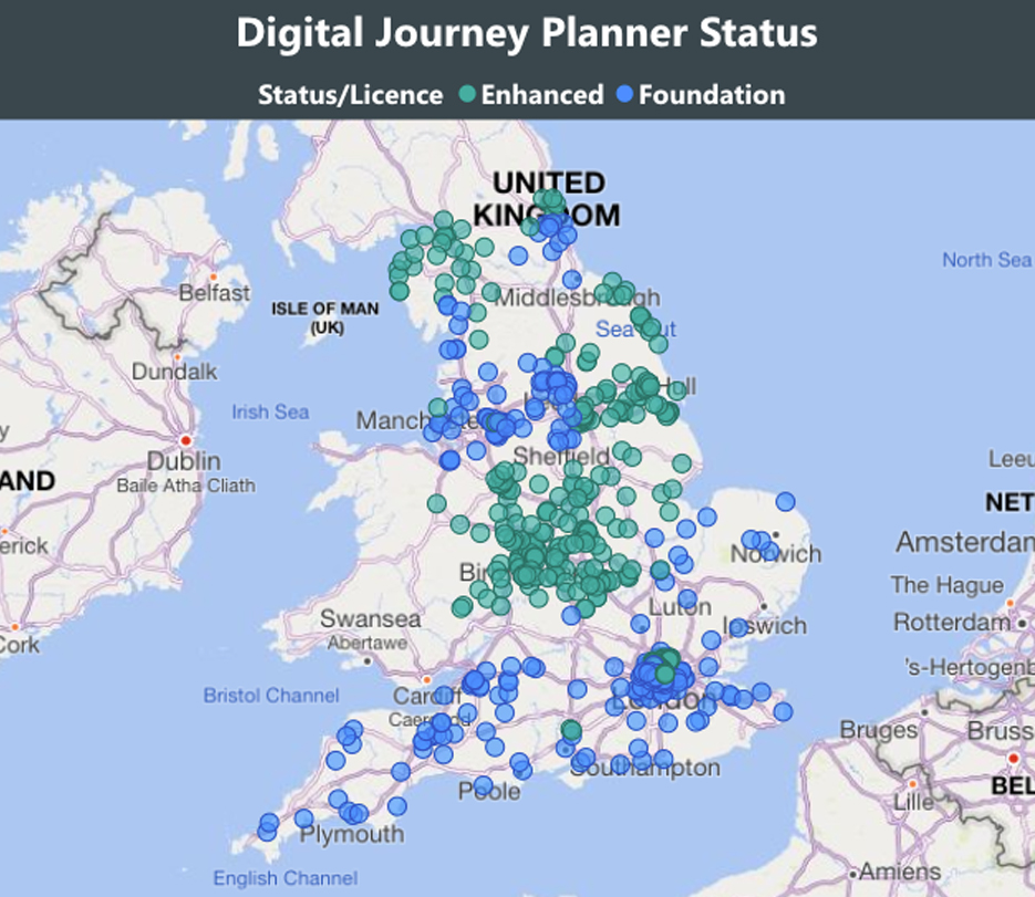
There are over 6500 GP practices in England, just over 900 in Scotland, almost 400 in Wales and over 300 in Northern Ireland, each serving their average registered population of 9000 people. That’s a lot of people to reach to reduce the variation of experience for users and for practice teams who provide information. We have incorporated this guidance along with simple advice, hints and tips into an easy-to-use system called the Digital journey planner (DJP). The first module; Patient Communications deals with Websites, Social Media and Messaging, The second module; GP Online Services covers everything that practice teams need to know to provide a good online service and make that easy for patients to use. If you are getting ready for patients having full online access to their medical records later this year, it’s a must. Our next module, due for release at end of Sept will be Digital Inclusion.
So far 10% of practices are using this system in England currently and we aim for 25% before the end of the year. At Redmoor Health we work with practice teams to help improve digital knowledge, skills, confidence and competence and offer support in terms of training, coaching, advice and share best practice resources that save practices time when searching for help. These guides are essential learning tools to embed in the DJP, so they are easy to find and stand alongside practical hints and tips when to use. Some areas have already commissioned Redmoor Health to carry out reviews across all their practice websites, just to get a feel for the scale of the problem and ideas how to help. Others have offered incentive schemes for practices to have the time and space to make the changes, so we anticipate this as a big opportunity to improve, standardise and simplify access to information.

Good suppliers have been using these standards for some time and have already created NHS style guided website templates, that meet the accessibility and usability needs of users and practice teams. Others recognise that they need to encourage practices to move away from old legacy systems, personalised styles and ‘whizzy websites’ to be more consistent, and to simplify the user journey. I’m quite sure many more will now take on these recommendations following the detailed patient user research that informed the guide. I spoke to a few to get their views of the research and guidance.
Iatro Practice 365 have already produced a simple version and template for practice teams to know what to add to their website. Thomas Porteus, CEO and Founder of Iatro said:
‘We’ve been behind the NHS Service Design Toolkit since we started, it’s been a pleasure to work with NHS teams openly and to be able to contribute our own code back to the project for the good of all NHS organisations. The guidance is a really great point of reference for practices wondering where to start, and what to avoid’
Tim Green, co-founder of GPsurgery.net, commented:
“As advocates for patient-friendly, accessible websites since we began working with GP surgeries in 2004, we warmly welcome this new evidence-based guidance from the NHS Digital First Primary Care team. Clearly focused on simplifying the patient journey, the guidance offers practical advice and tips for practices and commissioners aiming to improve patient experience, reduce digital inequalities and remove barriers to access for patients with disabilities.“
Dillon Sykes, NHS Partnerships Manager and Joe McGrath, Product Manager for Livi have been developing the full patient journey via their website platform to connect to the NHSApp.
‘At Livi we welcome this new guidance from NHS England. Accessibility is not about sticking assistive technology onto the website. It is about building the website from the ground up to work with third-party assistive technology (e.g. screen readers). It is also about ensuring the website content is written in a way that is clear and understandable by the majority of users. By using the NHS Digital Service design system, Livi websites are NHS branded, optimising functionality and providing confidence for patients to engage with online GP services (as well as other locally commissioned services and third-party tools). We believe practices should have generic accessible content and definitions of local service providers to help patients manage their own care. This approach has allowed us to build a practice website platform that gives practices back more time to spend on patient care by:
- nudging more patients to digital services and appropriate alternative NHS services
- reducing the time needed to manage and maintain the website

To the commissioners – let’s do this together…
Most useful in the website guide is valuable information for NHS commissioning teams to help procure GP websites ‘at scale’ and to know what to ask of suppliers in terms of user testing. Perhaps now is the time to rethink the stance that ‘it’s a GMS requirement to have an online presence’. This must be the way forward to support local population communications and connecting the services at a local level for patients. It will support primary care network development and reduce the burden on individual practices to know and learn about website technicalities, so they can just focus on the message and how it is presented or accessed. As more services are delivered together, why would we expect each separate practice to upload its own content and service description? Surely this is done once by the local service provider? Let’s take a current example. Practices will all be delivering Flu and Covid boosters soon. They need one single page for who’s eligible, then the ability to edit and add what’s happening locally, so that people know how to book and where to go. Currently each website supplier may duplicate this, and some are good enough to offer a ‘Flu’ content page. NHS England have issued the criteria in a Specification. Public Health (UK Health Security Agency) have some promotional material, and poor practice managers will be trying to make sense of it all to tell their patients what is happening, whilst awaiting the final dates from vaccine suppliers and working out which members of the team can deliver. One forward thinking area has thankfully collated all of this information together for its member practices and wait for it…… shared it as a google drive document to 200+ practices via email!!! That’s my Friday job folks – to upload and create this years Flu page.
Hopefully, you can see where I’m going with this. Do we really need 6500 individual digital front doors? I think not, but always open to be persuaded if you think the status quo is better.

Blog by Lisa Drake
Lisa supports commissioners at CCG/ICS & Regional level to help to deliver system change and modernise general practice. With almost 20 years experience in the NHS, as an ex-commissioner and Practice manager, Lisa’s work also involves advising practices and PCNs how to improve patients’ digital experience; how to deliver full range of GP Online services and streamline general practice workload. In addition to her role at Redmoor, Lisa remains in the NHS as a Digital Advisor in a practice in the Lake District.
Lisa is a mature student of the Open University specialising in Social Policy, Health and Care communications and relationships and is a member of the Expert Advisory Group for the Remote by Default Research with Nuffield Primary Care Health Sciences and University of Oxford.
Make an enquiry


